Making Of Skin Essence
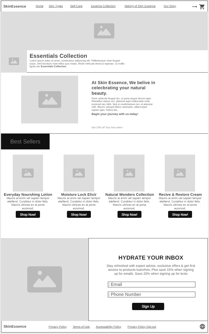
Home Page
On our website's home page, we made sure that it is designed in a way that makes the user have the best experience with browsing the website and identify its features and available sections in a very experimental and simple way. By that, there will be a large number of users who return to the website.
Moreover, we ensured promoting our website was clear and effective by adding the Essential Collection at the top to give users an overview of our core products and inventory. Besides that, having a best seller’s section on the home page provides great assistance to users to view our top and most rated products in Skin Essence. Also, making a description of each item gives the user an idea about the product and its benefits.
Additionally, displaying our brand purpose in a big and clear format confirms our identity in an appealing way to the visitors of the website. Correspondingly, discounts applied to first-order purchases encourage customers to make their first purchases. “Hydrate Your Inbox” has numerous effects on users of the website in a beneficial way. It drives users to sign up for emails and receive texts by gifting them discounts for that action and notifying them of new releases and offers, which in a real way creates a close relationship with our clients.
The layout of the website supports and helps developers make updates as it consists of sections including header, collection, best sellers, newsletter inbox, and footer. It also allows users to interact with the Skin Essence web by adding form fields, buttons, and visual elements such as photos, titles, and icons. Navigation is easy for the user while browsing, by having clear categories on the top, handy access to the shopping cart, key links in the footer, good use of white spacing for readability, and distributing elements to balance the page.
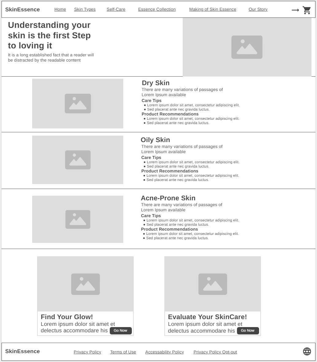
Skin Types
In the skin types page, we focused on giving a great impact to the user at the first time experiencing the website which is a perfect thing for promoting. The headline we put gives the user the ambition to read what is on the page and see what type of content it has. That also encourages customers to go back to the page as a reference.
We made sure that the website includes all skin types to verify the website is serving all people no matter their skin type. Having personalized content that includes tips and recommendations for each type of skin creates an easy environment for receiving the information and clarifying their skin type.
Besides that, we created a balanced design that has pictures and text to support each other and to make the page more interactive. Furthermore, setting buttons at the bottom of the page gives the user the impact of the desire to browse more on our website and keeps them engaged with it.
The design of the page is to make them be in sections, to have a clear and tidy vision for users and developers, and to make upgrades in the future more consistent and relevant to the page's style and function. Therefore, the navigation for users is very flexible and simple.
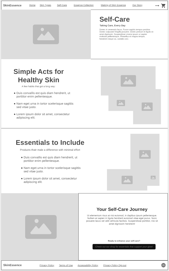
Self Care
On the self care page, we introduced to users approaches on how to go through a skincare journey. First, having a big headline at the top and an encouraging brief explanation of self care, poses curiosity and relifeness about the content.
The section “Simple acts for healthy skin” provides simple habits that can be performed easily and make big changes in the long term. That also shows users that the process of self care is not that much complicated, which will make them tend to take better self care of themselves.
The section of “Essentials to Include” offers general products and their effects on skin; this will guide users and give them a better version of skin care products and their usage.” Your Skin Care Journey” takes users to the shopping page after providing them with all the information they need.
The sequence of the content on the page enhances user navigation with reliability and engagement. Having the elements from images and text supports the appealing design of the self care page from all aspects. Moreover, developers can easily do upgrades and expansions to the page, as all content is well arranged and has a similar concept to other pages on the website.
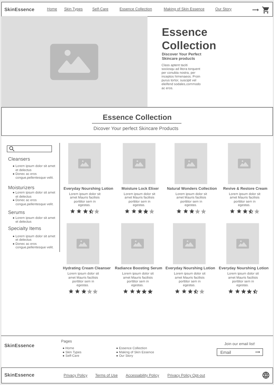
Essence Collection
On the Essence Collection page, we added a bold and clear headline up on the page beside a picture to have an appearance for users to discover our products. That will help with promoting the website. On the left side of the page, we created a search bar to look for products, and below it, we categorized our products into categories to show the variety of products and product types we offer, as that will make navigation easier and smoother.
We created a simple and functional design that satisfies our users and introduced our products in a clear way. To make products show in a beneficial way, we formed the product's picture to be in a good size for viewing it, added the product name in larger and bold text, put a short and valuable description for each product, set pricing for each good below the description, and placed a rating in stars to have an overview of products rates from our user’s perspective.
The fact that we offer products for daily use and other products for special conditions, users will tend to revisit our website to restock products and enjoy scrolling for new and trendy products. The customized, significant design and layout of the page will support developing upgrades, maintenance, and expansions in a great way.
Having links to our website’s pages at the bottom of the page will notify users to view or review other pages, whether to look for more information before buying products or to recheck recommendations based on their needs. Additionally, we added a box for joining email lists to have a close relationship with our users.
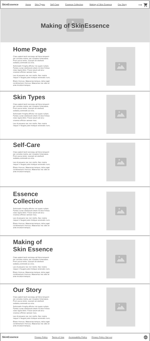
Making of Skin Essence
On the making of the Skin Essence page, we designed the page to show users our journey and justifications on how we designed the website, how ideas were delivered, and simplified it in the best form for them.
Because of that, the identity of the website has been more powerful as it shows all the perspectives we worked on establishing them. Setting the page into sections produced the delivery of subjects in a better way. As a result, the website is suitable for future updates and expansion because of its organized layout. Also, the well-arranged layout will make navigation more consistent and easier.
From a design perspective, we created a balanced page format from its contents, justifications on the left side of the page that includes all aspects of introducing and promoting information, how the website works on developing users' interactions, and tending to visit the website. As well as adding a mockup on the right side of the page in clear size, makes understanding the justification in a visual way which introduces a great combination of supporting elements for a positive overall experience for exploring the setups done before building the website.
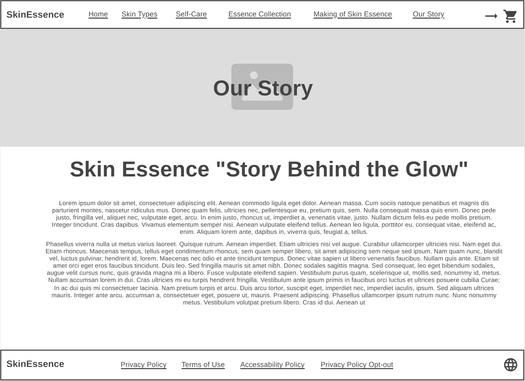
Our Story
The Our Story page focuses on telling the story behind our website and the brand identity we created and produced for users. We clarified our vision and mission that we want to establish in real life, which is making self care journeys enjoyable and successful.
On the page, we wrote the summary of what we’ve done and worked on from the beginning till the last steps we got into it. Also, we clarified the challenges we got through, how we dealt with them, and the learning outcomes we had in the process of building our website.
All of the things we did let our users understand our story, what we aim for, and the passion of providing a unique website for all people that covers all parts of self care, not only to sell products.
Dividing the story into multiple paragraphs makes reading the story easy, smooth and encourages users to complete reading to find out about the website. All that we mentioned supports having a great experience in navigation.